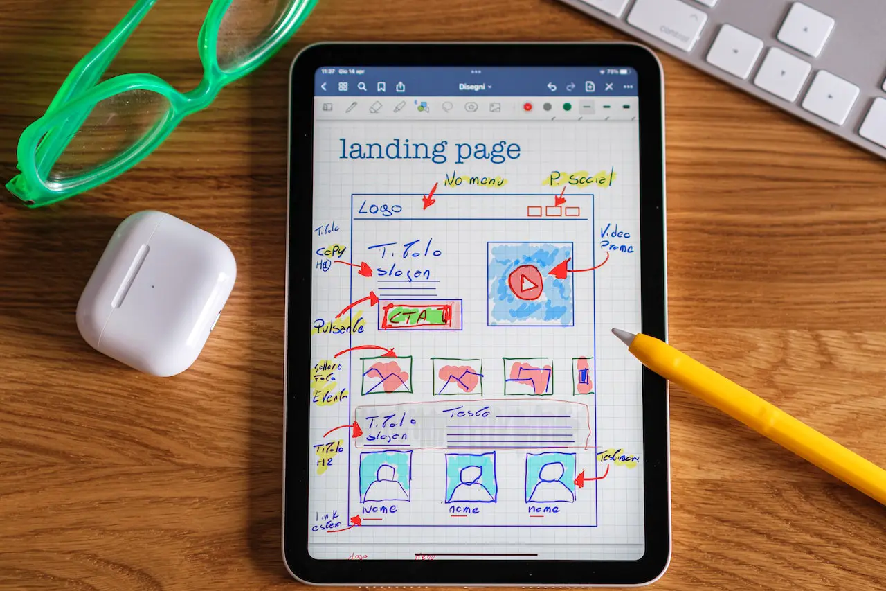
What Exactly is a Landing Page?
First, a landing page can be defined as a standalone web page or a designated page that is part of a more extensive website. Usually, a landing page is designed for a particular marketing strategy, product placement, or marketing campaign. Next, landing page design can range from a simple web page with text and images to more complex web forms, surveys, or downloads for more information. Furthermore, landing pages can be website product pages that lure a person into an online purchase or subscription signup. So, what exactly constitutes a good landing page design?
The Basics
Each landing page should be designed to meet the specific business goals first defined by the marketing plan or strategy. For example, the two landing pages would drastically differ if the marketing campaign and landing page intend to generate more sales leads instead of more online sales. The lead generator would not need the ability to transact and may require much less content. Users tend to be more willing to get more information or leave their contact information if the page provokes their interest in the offered product or service. Some products and services require much more information before being purchased; therefore, the landing page would not require an e-commerce capability for some products and services. Other products and services can be purchased immediately with little to no information necessary on the page. In these instances, a simple path to buying or subscribing is more prominent on the landing page. Many landing pages with higher conversions allow the ability of the customer to trial before buying, especially common for subscription-based business models like the SAAS model.
Keep it Simple
The design of the modern-day landing page seems to be getting complex. I often come across web and landing pages that are highly distracting with messaging and pop-ups; virtually everything you can think of is thrown at the user. I recommend using one prominent tagline that clearly explains your offer to the visitor. If you can quickly articulate in a tagline, the visitor will, too. Not being clear or using false claims in the tag will likely result in a high bounce rate for your landing page.
Don’t Distract the User
Far too often, I see pages with ten different color combinations, box callouts, page popups, buttons, social media links, “FREE Webinar” offers, etc. If you can’t clearly articulate your proposition, do you have a suggestion, or are you attempting to sell me something that doesn’t exist? Just be honest with people; let them decide if your product or service is right for them. Even if your product or service is not 100% ready, just be honest.
Let Them Come to You
Having an instant chat integrated into the page is a great idea. A triggered time-delayed message is also okay as long as it’s done respectfully and professionally. However, I think we’ve all experienced the site with the ringing bell in the bottom corner that frightens you when it goes off. Allowing a user to know you are just one click away from helping or chatting is one thing; ringing a bell at them is another. A bell or other sound effect should only ring when the customer wants your attention, not when you want a customer to buy from you. Again, let’s not distract the user and use common sense.
Create a Clear Path
From your tagline to a clear call to action, there should be a direct path the visitor can take to do what you’re calling them to do. While every product and service is somewhat different, the way a visitor gets information from your page is not. People naturally read from left to right, so let’s return to design basics. You wouldn’t want your main message towards the bottom of the page, just like you shouldn’t ask the person to give you information in a popup before understanding why they’re on your page. Making a clear pathway to your goal will drastically increase conversion on your page.